

fid-dle, verb: to manipulate something, as to adjust it; to tinker.
Wednesday, August 31, 2011
Houston Texans Concept Helmet, Version 2
I noticed that my last three designs were all from the AFC South. This wasn't intentional. But, in keeping with that theme I decided to break out another Houston Texans concept design. This is the seldom seen alternate logo of the Texans. It's probably seldom seen because it's not very good, in my opinion. But, bad logo or not, I'd like to see a white helmet paired with their alternate red jersey/white pant combination.

Tuesday, August 30, 2011
Indianapolis Colts Concept Helmet
The basic principal of helmet logo design is to keep it simple, which is certainly accomplished in the Colts current horseshoe design. It is very simple. But, considering the monochromatic simplicity of their uniforms, I think their helmet logo could stand to get gussied up a bit. Not that I got carried away with this redesign, but it is definitely busier than a solitary horseshoe.

Monday, August 29, 2011
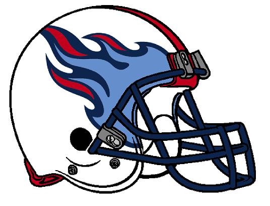
Tennessee Titans Concept Helmet
One of my most despised teams, yet one of the coolest redesigns so far. It's basically removing the "T" emblem and enlarging the flames. I typically don't like two different shades of blue on one uniform but I think it works well in this concept design. 
Friday, August 26, 2011
Jacksonville Jaguars Concept Helmet
It has been a long while since my last post but the dawn of a new football season has inspired me to create a few more helmet designs. The first of many posts to come is this new Jacksonville Jaguars concept. Enjoy.


Tuesday, February 22, 2011
Buffalo Bills Concept Helmet

Eliminate the blue stripe. Actually, eliminate the blue altogether. Go with a "Red Wings" style color scheme.
And... if and/or when the Bills move to Toronto, having a buffalo logo wouldn't make much sense. I doubt they would become the Toronto Bills. So keep the logo and become the Toronto Bison.
Thursday, February 17, 2011
San Francisco 49ers Concept Helmets

The top helmet depicts an adaptation of the 49ers logo used from 1946 to 1967.
The bottom helmet is sans logo, because if there's any team out there that would make sense not to have a logo, it's the 49ers. Their heads could look like big shiny gold nuggets.

Wednesday, February 16, 2011
Denver Broncos Concept Helmets

The top design is the old colors with an adaptation of an even older logo. The second is the old logo with current colors.

Subscribe to:
Posts (Atom)