

fid-dle, verb: to manipulate something, as to adjust it; to tinker.
Thursday, October 13, 2011
Seattle Seahawks Concept Helmet, Version 2
Here's another Seahawks concept. I must have a fascination with the wing design.

Wednesday, October 12, 2011
Minnestota Wild Logo Redux
The NHL season is upon us, and while the Minnesota Wild have a great logo, I think they should stick with the old North Stars colors. It's not like Dallas is really using them anyway.


Tuesday, October 11, 2011

Monday, October 10, 2011

Friday, October 7, 2011
Kansas City Chiefs Concept Helmet, Version 2
Based on the Chiefs logo from 1963-1971, here's a very retro design.


Thursday, October 6, 2011
Vancouver Canucks Redux
I really like the Vancouver "C" logo but I'm bothered by the weird broken line on the right side. I assume they wanted to accentuate that the negative space forms a hockey stick, but I don't think it's really necessary.


Chicago Bears and Negative Space
Just a quick post to see if anyone else also sees something odd within the negative space of the Chicago Bears stylized "C" logo. Whenever I look at it I can't help but think it looks like a giant walnut being cracked by a spoon. Here, let me illustrate...


Wednesday, October 5, 2011
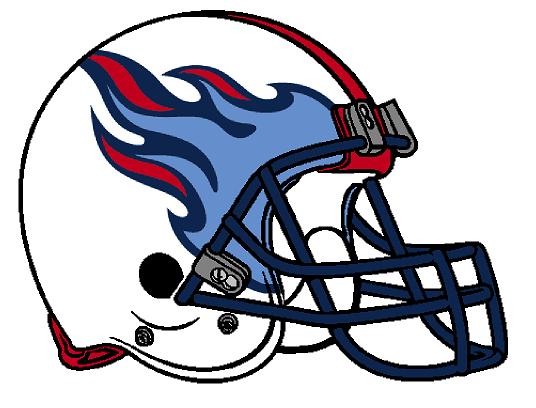
Tennessee Titans Concept Helmet, Version 2
Here's another version of the Titans flame helmet posted a while back.


Tuesday, October 4, 2011

Monday, October 3, 2011
Two Cincinnati Bengals Concept Helmets
OK, Cincinnati, we get it. Your uniforms are a tad eccentric and garish. Maybe it's time you grow up and pull back the reins a bit. Here are a couple of ideas to get you started.


Friday, September 30, 2011
San Diego Chargers Concept Helmets, Logo
I'm frustrated with the Chargers. I keep tweaking and tweaking but nothing looks right, so I'll just post them all. The first is a redesigned logo based from their 1961-1973 design. And, if you can't tell, the next three are helmets.


Thursday, September 29, 2011
Cleveland Browns Concept Helmet, Versions 2a and 2b
A while back I posted an incredibly awesome Cleveland Browns concept helmet design. Well, here's another with two different color variations. Enjoy.


Tuesday, September 27, 2011
New York Jets Concept Helmet, Version 3
I really like black and green together, so here is yet another Jets concept helmet with said color scheme.


Monday, September 26, 2011
Dallas Cowboys Concept Helmet
There isn't much tweaking that can be done with what the Cowboys have given us so far. Not much has really changed with them over the years. So, for now, here is a Cowboys helmet with rearranged colors. I could probably come up with something better, but it's the Cowboys. Nobody really likes the Cowboys, right?


Friday, September 23, 2011
Two New York Giants Concept Helmets
A silver dome for the G-Men? Maybe something a little Bills-esque? Here, have them both.


Thursday, September 22, 2011
Washington Redskins Concept Helmet, Version 2
About a week or so ago I posted two concept logo designs for the Redskins. Here's one of them on a helmet.


Wednesday, September 21, 2011
Baltimore Ravens Concept Helmet, Version 2
It's a bird. It's a plane... No, it's a bird. I was right the first time.
Here's another Ravens design. Enjoy.

Here's another Ravens design. Enjoy.

Tuesday, September 20, 2011
Cleveland Browns Concept Helmet
I usually give a brief explanation/description about whatever it is I'm posting, but I don't feel like doing that today. I do like this helmet, though. It's slightly whimsical. There, I guess I gave a brief explanation/description anyway.


Monday, September 19, 2011
Kansas City Chiefs Concept Helmet
Well, the Chiefs' season appears to be heading towards the crapper fairly quickly. I thought I'd attempt to make them feel better by presenting an alternate helmet design. Here it is.


Friday, September 16, 2011
Pittsburgh Steelers Concept Helmet, Version 2
My current favorite throwback uniforms in football are that of the Pittsburgh Steelers. I really like the Bears and Packers retros, too, but the Steelers are the best. I especially dig the yellow helmets, although I think this white concept design would work well, too.


Thursday, September 15, 2011
New York Islanders Fisherman Logo, Take 2
In 1995, the Islanders unveiled a logo so disliked by fans that the team immediately discarded it as soon as the league allowed them to do so. However, I thought parts of the logo were decent. I gave myself the task of redesigning the infamous logo in an attempt to present something that would be more acceptable to loyal Islanders fans.
There were two major issues with the original logo. First, seafoam green is an absolutely ridiculous color. This is a hockey logo, not bathroom wallpaper. Secondly, the Islander fisherman guy has a severe case of jaundice.
After removing the unnecessary seafoam green and curing the fisherman’s visible ailments, the next step was to simplify the border of the logo, then recolorize the blue and orange to the traditional Islander shades.
So here they are, before and after…

Wednesday, September 14, 2011
Carolina Panthers Concept Helmet
Cam Newton set a rookie record by passing for nearly 4 bazillion yards (plus or minus) in his first game. And for that, here's a new Carolina Panthers helmet design.


Tuesday, September 13, 2011
Oakland Raiders Concept Helmet
Here's a Raiders concept helmet in honor of their big Monday night victory over the Broncos. This design is another that doesn't top the current design, but at least it's something different. This is the logo they used from 1960 to 1962. It's not bad, but anything not solely black and silver just doesn't suit the Raiders anymore.


Monday, September 12, 2011
Baltimore Ravens Concept Helmet
In celebration of the Ravens' impressive victory over their rival Steelers, I thought I'd post a concept helmet for them. I attempted to give them a winged version. It didn't quite evolve as easily as I initially hoped but I think it's at least worth posting. You should still get an idea of the look I was hoping for.


Friday, September 9, 2011
New Orleans Saints Concept Helmet
This may look too much like a recolorized version of the Louisiana Tech helmet, but oh well. I think it looks good from a retro perspective. This helmet with white jerseys and white pants would look nice. But what would be really nice is if their fans would stop saying "who dat". It's ridiculously annoying.


Thursday, September 8, 2011
Green Bay Packers Alternate Uniform
Since tonight marks th beginning of the 2011 NFL season, and the Green Bay Packers are taking part, I thought it would be appropriate to dream up some new duds for the occasion.


Wednesday, September 7, 2011


Tuesday, September 6, 2011
New York Jets Concept Helmet, Version 2
It doesn’t get much more simplistic than this design. It’s basically a color reversed adaptation of the team’s 1963 helmet design. I also removed the word “Jets” from the old logo. I thought it was a tad redundant to inscribe "Jets" across a jet.

Monday, September 5, 2011
New England Patriots Concept Helmet
One of the most classic helmets in the history of the NFL is the hiking patriot worn by New England from 1961-1992. Here is the same color scheme from that period along with the tri-corner patriot hat atop stylized N.E. initials.


Friday, September 2, 2011
Miami Dolphins Concept Helmet
There have been a couple of teams recently update their helmet design for a more modern look while keeping the same basic design. The Cardinals gave their bird a little more attitude, the Vikings slightly tweaked their horns. The Dolphins could use a slight modernization, too. Here we have the same basic design but the sun was removed and the dolphin was enlarged and recolorized.

Wednesday, August 31, 2011
Houston Texans Concept Helmet, Version 2
I noticed that my last three designs were all from the AFC South. This wasn't intentional. But, in keeping with that theme I decided to break out another Houston Texans concept design. This is the seldom seen alternate logo of the Texans. It's probably seldom seen because it's not very good, in my opinion. But, bad logo or not, I'd like to see a white helmet paired with their alternate red jersey/white pant combination.


Tuesday, August 30, 2011
Indianapolis Colts Concept Helmet
The basic principal of helmet logo design is to keep it simple, which is certainly accomplished in the Colts current horseshoe design. It is very simple. But, considering the monochromatic simplicity of their uniforms, I think their helmet logo could stand to get gussied up a bit. Not that I got carried away with this redesign, but it is definitely busier than a solitary horseshoe.

Monday, August 29, 2011
Tennessee Titans Concept Helmet
One of my most despised teams, yet one of the coolest redesigns so far. It's basically removing the "T" emblem and enlarging the flames. I typically don't like two different shades of blue on one uniform but I think it works well in this concept design. 
Friday, August 26, 2011
Jacksonville Jaguars Concept Helmet
It has been a long while since my last post but the dawn of a new football season has inspired me to create a few more helmet designs. The first of many posts to come is this new Jacksonville Jaguars concept. Enjoy.


Tuesday, February 22, 2011
Buffalo Bills Concept Helmet

Eliminate the blue stripe. Actually, eliminate the blue altogether. Go with a "Red Wings" style color scheme.
And... if and/or when the Bills move to Toronto, having a buffalo logo wouldn't make much sense. I doubt they would become the Toronto Bills. So keep the logo and become the Toronto Bison.
Thursday, February 17, 2011
San Francisco 49ers Concept Helmets

The top helmet depicts an adaptation of the 49ers logo used from 1946 to 1967.
The bottom helmet is sans logo, because if there's any team out there that would make sense not to have a logo, it's the 49ers. Their heads could look like big shiny gold nuggets.

Wednesday, February 16, 2011
Denver Broncos Concept Helmets

The top design is the old colors with an adaptation of an even older logo. The second is the old logo with current colors.

Tuesday, February 15, 2011
Houston Texans Concept Helmet

This concept design uses the Interstate shield. Considering Texas has more than 3,200 miles of interstate, which is more than any other state, I thought it would be cool to incorporate it somehow. Each player's uniform number would be represented within the shield.
Tampa Bay Buccaneers Concept Helmet

Monday, February 14, 2011
Minnesota Vikings Concept Helmet

This logo is an adaptation of the Vikings anniversary logo. The white shell minimizes the purple, obviously, and brings the gold into a more dominant position. This would look good with a gold alternate jersey and white pants.
Wednesday, January 26, 2011
Detroit Lions Concept Helmet

Subscribe to:
Posts (Atom)